Visual identity proposalVersion 01 · 2026
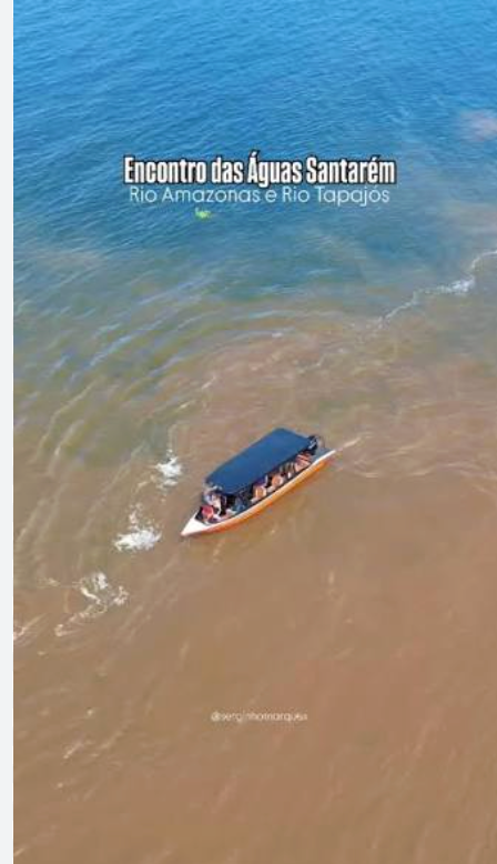
The river leads to the encounter.
Zoé brings healthcare by river, by air or by road. This identity is born of that journey: of the forest, the sand and the river.
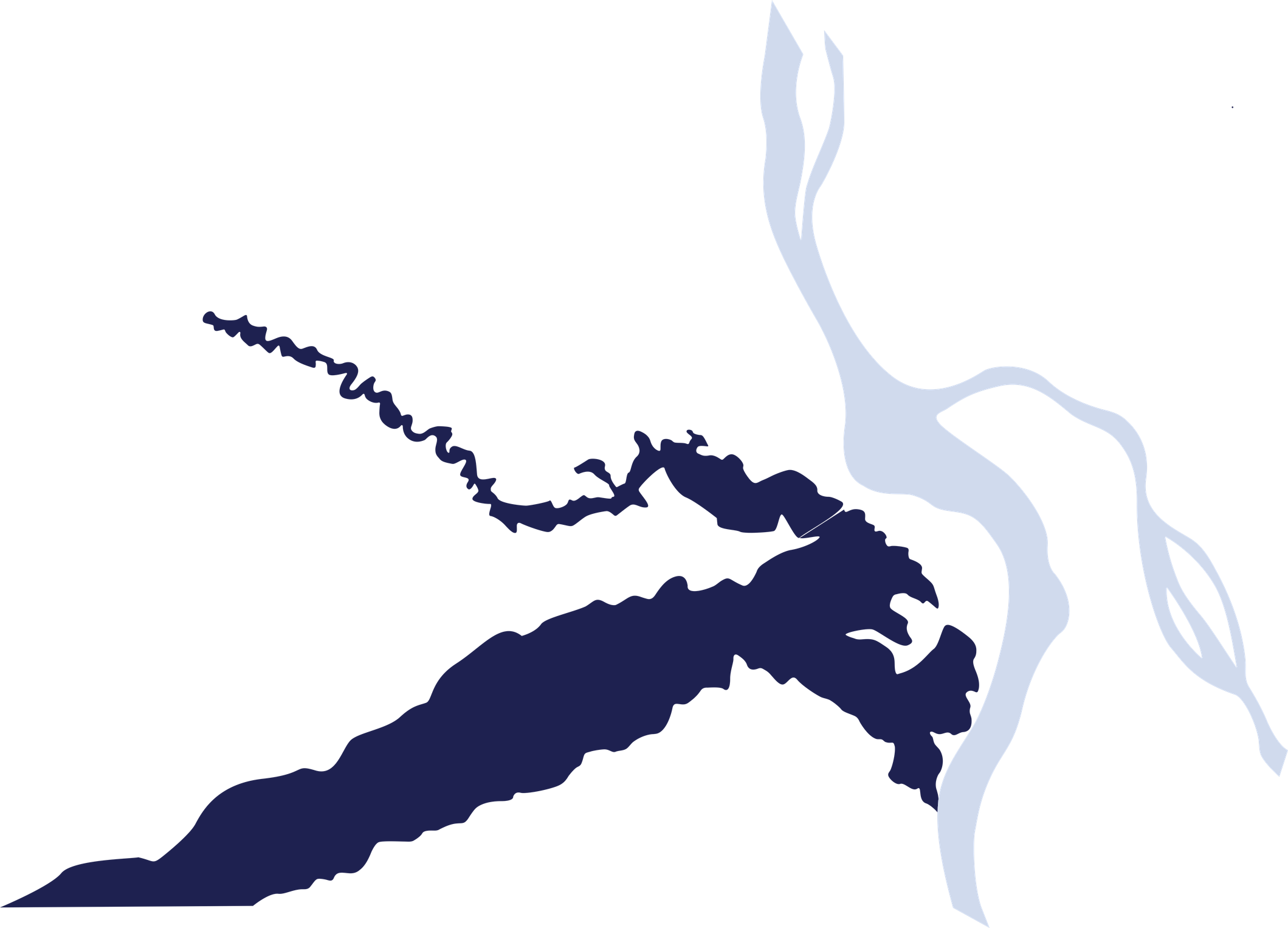
The river is the way. The encounter is the destination.
Zoé exists to reach where specialized healthcare does not. From Santarém, the teams travel for hours — sometimes days — to riverside and Indigenous communities. The river is not scenery, it is the road. When neither boat nor car can make it, we fly.
At the end of the journey is the encounter — the very thing the symbol already carries: two hands reaching for each other. Zoé arrives, meets, and each side remains whole. Care happens on the living border between two worlds: doctors and river dwellers, donors and territories, city and forest.
The visual system is geographic: blue is the river; green is the forest on the bank; the base is the white sand of the beaches, with the golden line running along the borders; and the orange of the Tapajós sunset is the warm accent: calls to action, glints and hero numbers.
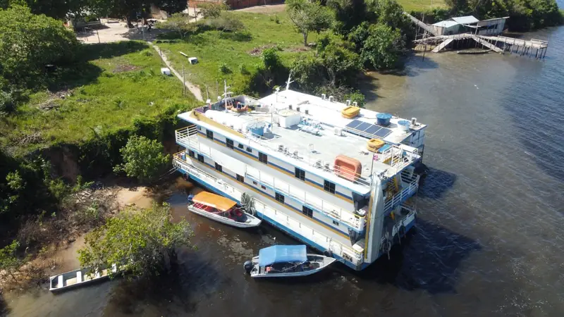
“Meet without erasing.”
The core idea of the brand. The whole visual system derives from it.
Forest, sand and river.
The main scheme of the identity. On content-heavy pieces, two fields at a time.
 Vertical alternative
The logo already was an encounter.
The Z in Zoé is formed by two hands reaching for each other — the one who cares and the one who is cared for. The symbol stays untouched. The hands meet the way the waters meet.
Rules of use
The hands that form the Z never change shape, proportion or color. These rules protect the one element that may not vary anywhere in the identity.
Six official versions

Clear space
Keep, on every side, a margin equal to the height of the symbol (one hand). No text, photo or border may enter that zone.
Minimum size
Below this the hands stop reading. Never scale it down further than these limits.
What never to do
- Do not stretch or distort the proportion.
- Do not recolor outside the official palette.
- Do not rotate or tilt the symbol.
- Do not place it over a low-contrast background.
Color scheme.
Click a color to copy its hex code.
Usage proportion
- Sand/White · 50%
- Blue · 26%
- Green · 14%
- 10%
Territory palettes
From the study by designer Carol Puppe: each territory has a palette of its own, picked from photographs of the place.
- ArapiunsClear water and sky — soft blues, forest green and sand.
- BelterraSolid ground and timber — ochres, browns and deep green.
- Mapuera and Zoé'sAnnatto red, warm ochres and earth.
Territory textures — matter as a background
When a piece calls for matter, the real textures — sand, earth, clay and water — come in as a photographic background in place of flat color.
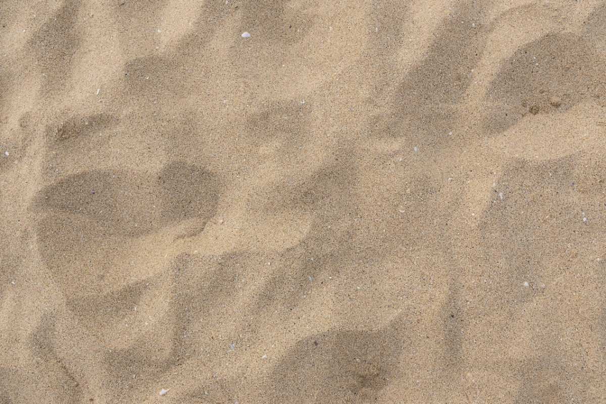 Sandin place of Areia Branca
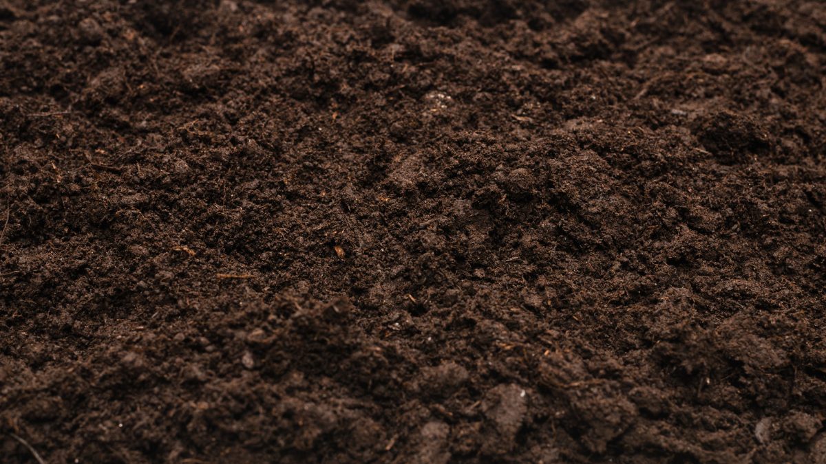 Earthsolid ground · Belterra palette
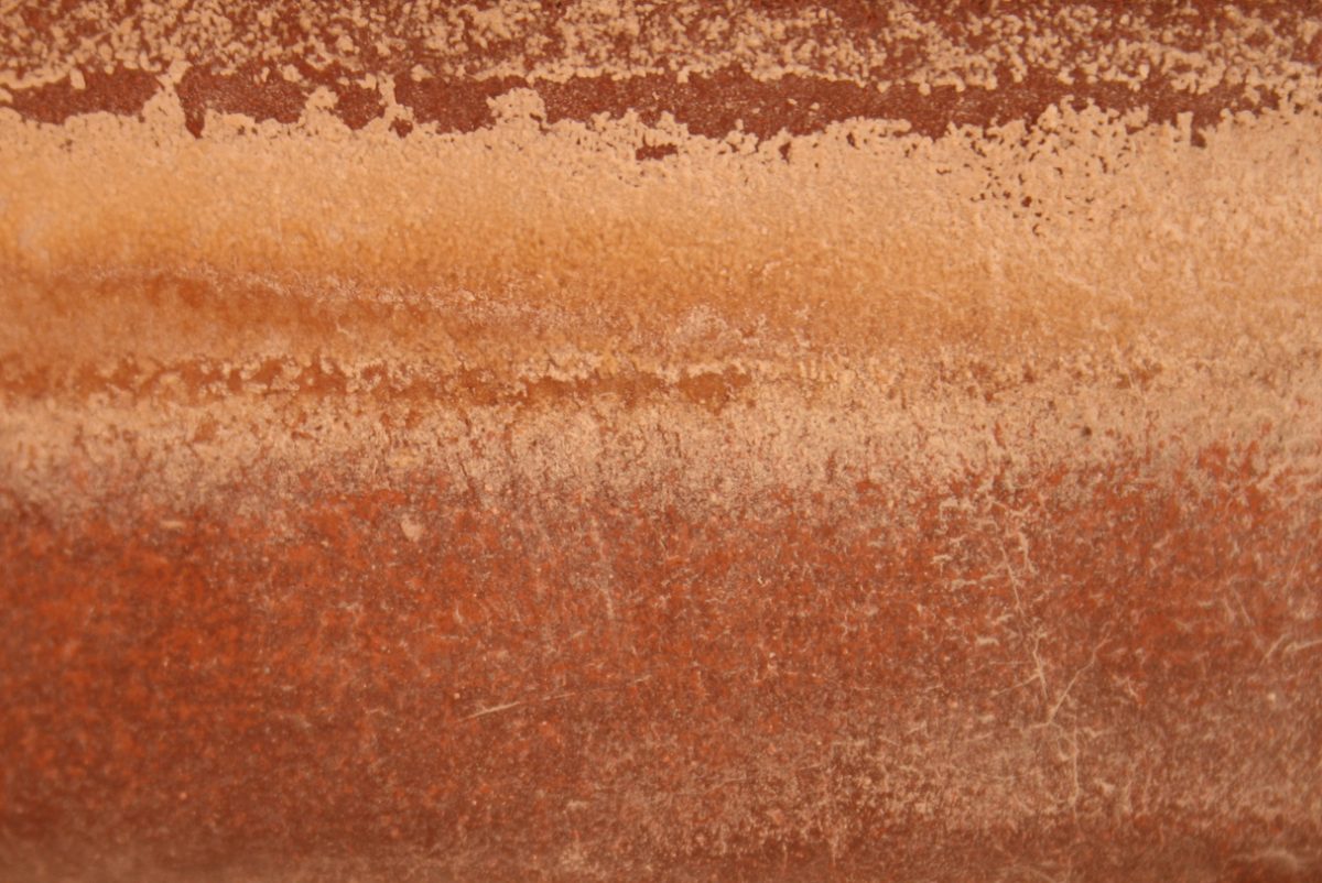 Clayin place of Sol do Tapajós
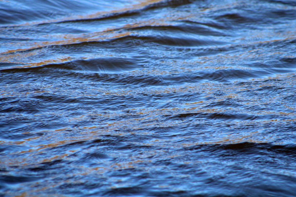 Waterin place of Azul Tapajós — the logo signs in solid white
The Linha do Encontro.
The meeting line is not a decorative wave: it is the riverbank — the living line where the boat touches the community, drawn from the real contours of the map. The fields are blue, green, sand or white — and along the border runs the golden line of the beach.
- 1 · Field dividerTwo fields — blue and sand — and the golden beach line running along the border. Use: covers and section transitions.
- 2 · Vertical riverbankA vertical version for the sides of a piece, page markers and stationery.
- 3 · Double tributaryThe river and the beach running together; covers and chapter openings.



Always — organic and irregular, like the real riverbank; a single line per piece, separating two fields; the golden line following the border.
Never — a regular zigzag or a perfect sine wave; a loose line with no fields; whole fields in sun color — the sun is a stroke, never a field.
A river for every piece.
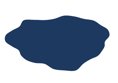
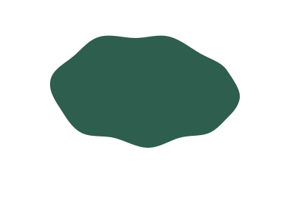
Shapes derived from the real geography of the rivers, always in the palette colors. They build posts, covers and materials together with cut-out photos — layers of water over the white sand, never competing with the people.
- Body of waterThe deep channel. A highlight background for numbers, headlines and cut-out photos.
- IslandThe green counterpoint to the body of water. A background for territory and forest topics.
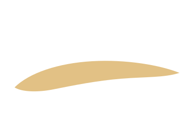
- SandbankAn elongated golden band. A discreet base for numbers and signatures.
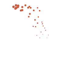
- Sun glintsThe sunset reflected on the water. Transitions, corners and the tips of shapes.
Field dividers
Twelve lighter variations to separate sections without weighing them down. Always one per border, never stacked.
- Linha do encontro · blue
- Linha do encontro · green
- Linha do encontro · stroke
- Vertical riverbank
- Beach divider
- Double tributary divider
- Dotted divider
- Glints divider
- Forest divider
- Tributary
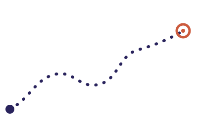
- Expedition route
- Bankside forest






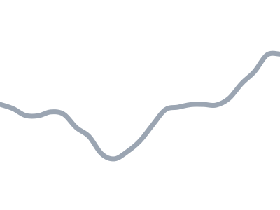
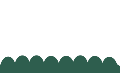
- Drawing by Carol Puppe: the geometry of the Tapajós and Arapiuns rivers taken from the map — the basis of the whole graphic system.
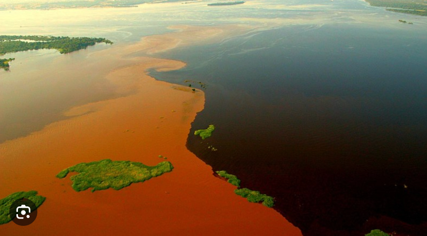
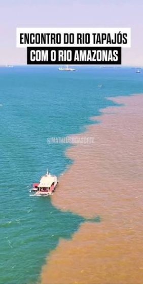
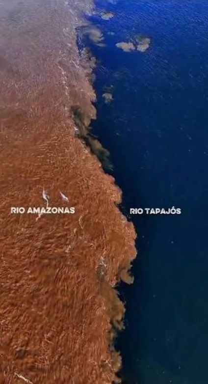
Quick rules — 1 to 2 shapes per piece · always in the palette colors · the cut-out photo always on top · the sun comes in as a stroke or a glint, never as a field.
The territory in one continuous stroke.
Eighteen icons drawn with the same loose stroke as the tributary — a single line, rounded ends, one clay accent per icon. They punctuate infographics, reports and posts: the journey (canoe, boat, plane, car, dirt road), the territory (river, tree, forest, stilt house, hammock, fish), the people (volunteers, doctors), the graphic marks and the arrows that guide the eye.


Quick rules — a single stroke weight, always in palette colors · one clay accent (or golden) per icon, never more · one icon per block of information, minimum size 24px. The package ships an SVG (blue and white) and a transparent PNG of every icon.
Warmth in the headline, precision in the body.
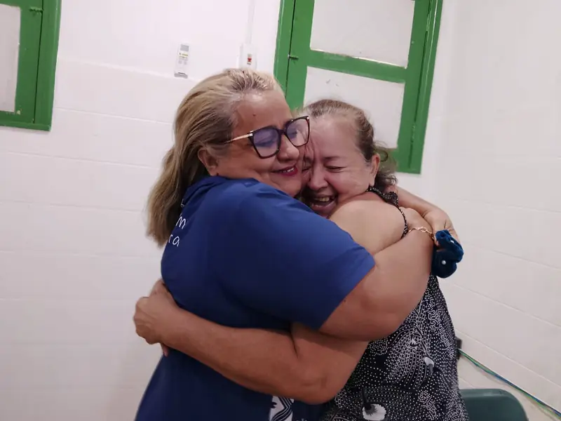
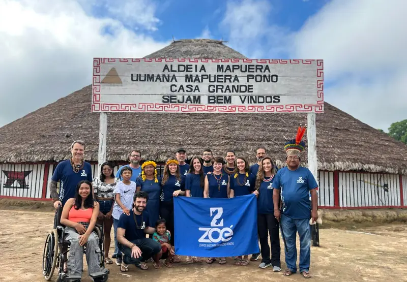
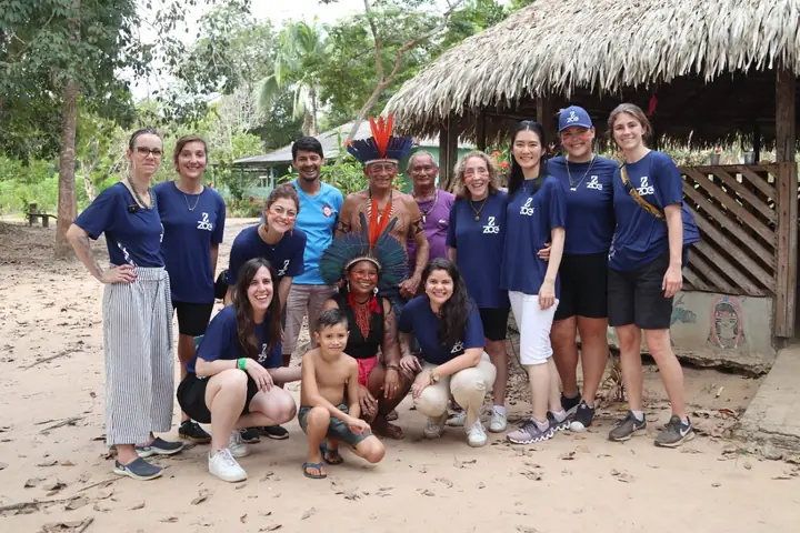
The real photograph is the protagonist.
No heavy filters: the people and the territory appear as they are. The identity comes in through the frame alone.
The number is the proof.
Data carries the transparency that wins over the institutional donor. Big numbers in Young Serif; context in Jost; the sun reserved for the figure that matters most in each piece.
- 7expeditions in 2026
- +5,000consultations in the first half of the year · the hero number, in sun color
- 1,589exams, many of them the first in a lifetime
- 487people treated in Aldeia Mapuera
- 420Arapiuns
- 610Tapajós
- 955Mapuera
- 530Maró
- 700Suruacá
Bars in clear water; the sun highlights the peak. One emphasis color per chart — never the rainbow.
Chart rules
- One emphasis color per chart — the sun marks the data that matters.
- Clear water for the other series; green only for environmental data.
- No 3D, shadows or sliced pies. Bars and lines, honest ones.
We speak like someone who was there.
Concrete with donors, dignified with the territory.
Concrete, not abstract
"487 people in Mapuera", not "we impact lives".
Dignified, never pitying
The river dweller is the protagonist, not a victim. We show strength and care, not misery.
The donor is the encounter
"Your donation takes the team where no one else goes." Support is the bridge between the two worlds.
Transparent by default
We report with open data. Institutional trust is built on evidence.
We say
- "There were 1,589 exams in people who had never had one."
- "The team went up the Tapajós for two days to reach the village."
- "Your donation secures the next expedition."
We avoid
"We transform thousands of lives every day.""Needy and forgotten communities of the forest.""Help these people who need it so much."
Social media.
Three official color combinations for Instagram — always with the logo and a single accent per piece.
- Health arrives by boat.ongzoe.orgLightSand + blue + sun, water at the base. The everyday feed.
 1,589 examsongzoe.orgDarkBlue + sun reflection + golden line. Data and impact.
- Forest, sand and river.ongzoe.orgTerritorySand + green + gold. Expeditions and the environment.
ongzoe.org — the encounter in motion.
A proposed direction for the website — not applied live yet. In digital the identity gains subtle motion: the riverbank sways, the tributary draws itself slowly. Always slow and continuous, like the river: nothing blinks.
Inner sections — light and dark
Associação de Apoio à Saúde de Populações Remotas. Visual identity · concept “O rio leva ao encontro” (the river leads to the encounter) · July 2026. Visual identity design and study: Andréia Laplana.
Pará · Brazil